Project overview
This was a project / case study for my UX design training course at Mission Ready HQ. This project was to asses and redesign the car insurance aspect of the Turners Cars website.
The project brief
Turners Car Auctions is a market leader in the automotive industry in New Zealand, responsible for more than 10% of all used vehicle sales in the country.
It has retained its original function as a vehicle auctioneer, operating in 19 branches nationwide, but has become increasingly dependent on a parallel role as a conventional used vehicle dealership.
In support of that role, it has established in-house finance and vehicle insurance divisions that allow it to offer buyers a complete “one-stop shop” experience.
The project team
Designers
- Kahu Leary
- Ineke Gruijters
- Jacquie Wong
- Seoha Kim
Developers
- Jene Hamahona
- Jimson Montederamos
- Jorge Marquet
- Josh Va’aelua
Research & Analysis
In any design project, the path to success begins with a deep understanding of the users, their needs, and the challenges they face.
Equally important is aligning the project with the goals and expectations of stakeholders. In our pursuit of enhancing the car insurance experience for Turners Cars’ diverse customer base, we recognised the need to embark on a comprehensive phase of research and analysis, addressing both user and stakeholder perspectives.
In doing so the aim is to unearth valuable insights, allowing us to craft solutions that would not only meet but exceed user expectations and align with business objectives.
Stakeholder research
It’s important to align the businesses needs with the needs of users, and in order to do so it’s important to get as much information as possible from as many of the stakeholders as we can.
In our pursuit of refining the car insurance aspect of Turners Cars, gaining insights into stakeholder perspectives played an important role. Through a structured interview process, we uncovered valuable information that guided the direction of our project.
This section provides a summary of key findings and insights gleaned from these stakeholder interactions, laying the foundation for our subsequent design efforts.
It’s important to note that this was a simulated exercise, with a fictitious stakeholder, conducted for the purpose of this case study.
Interview findings
During the interview, Turners Cars expressed a strong desire to enhance the user experience when purchasing motor vehicle insurance. Their objective was to create a faster, more convenient, and user-friendly process.
In their assessment, several user pain points came to light, including complexities in the existing process and the lengthy duration required for generating insurance quotes.
To gauge success, Turners Cars established key performance indicators (KPIs) centered around increased insurance policy sales, heightened customer satisfaction, and expedited quote and policy issuance. However, the project operated within certain constraints, notably a budget capped at $150,000 and a timeline of six months, following an iterative approach.
A primary focus was placed on streamlining the quote process, recognising its significance in achieving the project’s goals. Notably, there were no significant technical constraints identified, allowing for flexibility in implementing design and technology solutions.
To structure the project, milestones were established, including the delivery of a Minimum Viable Product (MVP) within the first two months, followed by iteration 2 at the four-month mark, and full project completion targeted for the six-month mark.
With a comprehensive understanding of Turners Cars’ business goals, we proceeded to conduct user research, aiming to gain deeper insights into user perspectives and needs.
User Research
In our user interview, we discussed her experience with Turners Cars dealership, and it’s insurance services.
Interview findings
The user initially went to the Turners Cars website to browse their selection of cars and was generally pleased with the layout and ease of use on both her mobile device and laptop. However, she was unaware of their insurance offerings until she visited their physical location.
She found the website’s insurance section to be confusing and lacking in clarity. She had trouble understanding the differences between various insurance policies and had difficulty obtaining price quotes online, which led her to communicate with Turners via email and phone calls or in person at their specified location.
When asked about the website’s layout and features, our user emphasised the importance of clear, informative diagrams and visual aids, as long as they enhance understanding rather than causing confusion.
The user suggested that it would be beneficial for the website to provide an indication of their insurance offerings while customers are browsing cars. This would make the insurance process more convenient and potentially encourage customers to consider insurance options during their initial visit to the website.
She also mentioned that having clearer and more immediate access to assistance would be helpful, as she encountered some issues while using the website and had to rely on email communication.
Overall, this interview highlights the importance of a user-friendly, informative, and transparent website interface, especially in the context of providing insurance services alongside car sales.
Articulating research results
Following our research, we recognised the significance of translating our insights into practical forms. To achieve this, we leveraged a range of methods including personas, empathy maps, user stories, user journey maps, problem statements, and “how might we” statements. These tools served the purpose of making our findings relatable and facilitating their seamless integration into the final design.
By employing these techniques, we deepened our understanding of our users and ensured that their needs remained the focal point throughout our design process, serving as a guiding light for our decision-making.
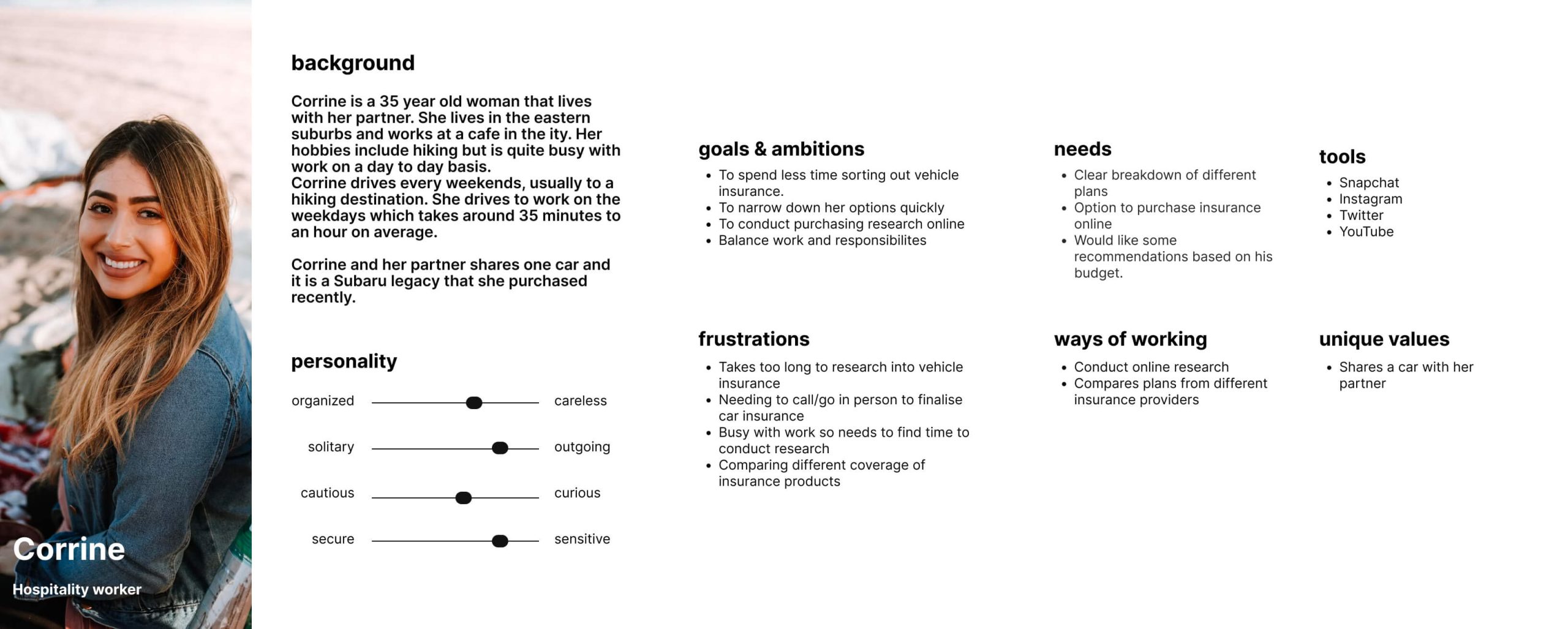
Persona – Corrine
Our first persona was Corrine, a 35-year-old woman living in the eastern suburbs and working at a cafe in the city. She’s an outdoor enthusiast with a passion for hiking, although her busy work schedule often keeps her tied up. Corrine shares a Subaru Legacy with her partner, which they recently purchased. She commutes to work on weekdays, spending an average of 35 minutes to an hour on the road. On weekends, she enjoys driving to hiking destinations.
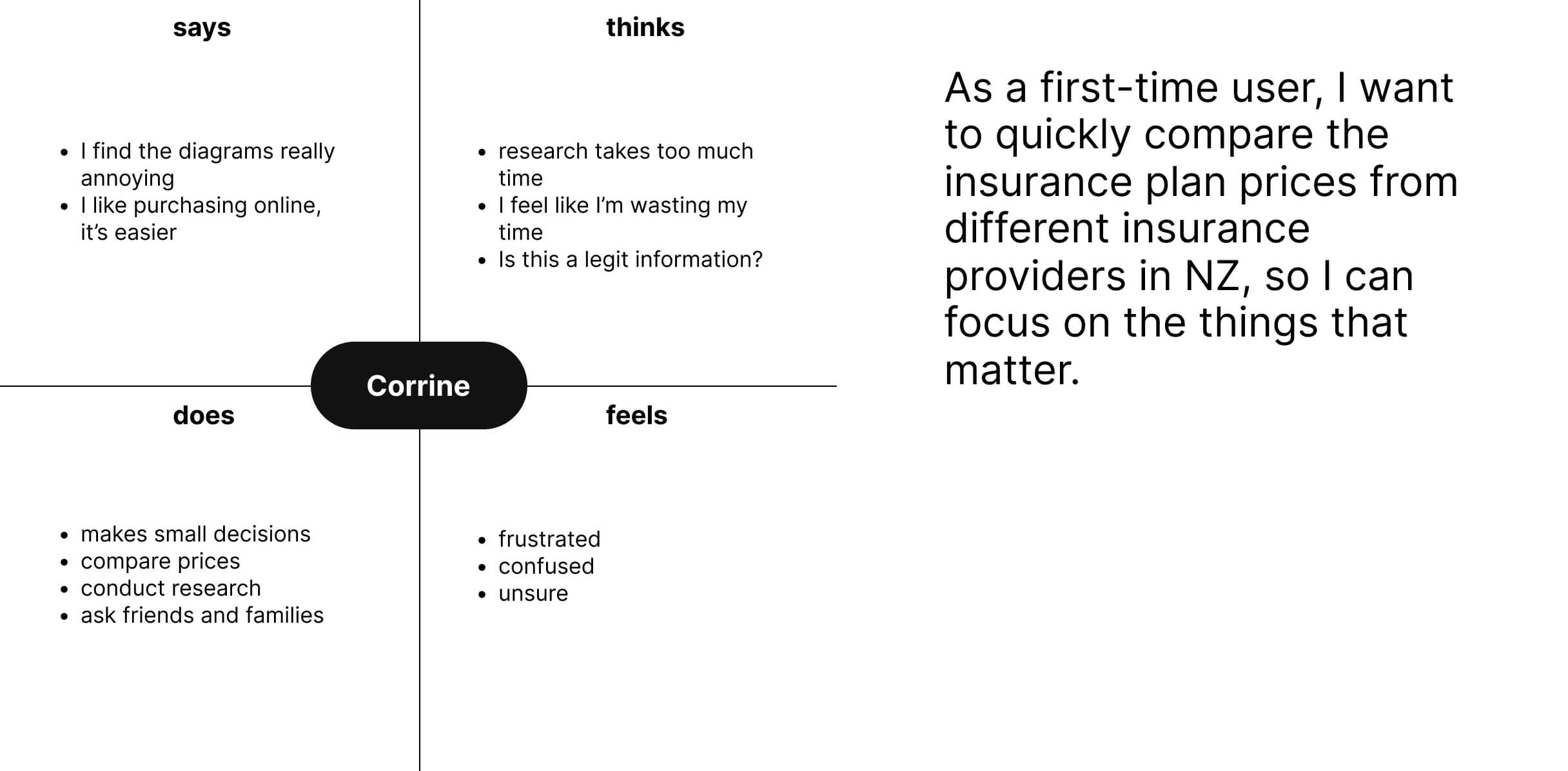
Empathy map & user story
In order to gain more insight and articulate users emotions, thoughts, behaviours, and needs we made use of empathy maps. By pulling in the information from our user interviews this tool allowed us to understand their perspectives deeply, identify their pain points, and design solutions that truly resonate with them.
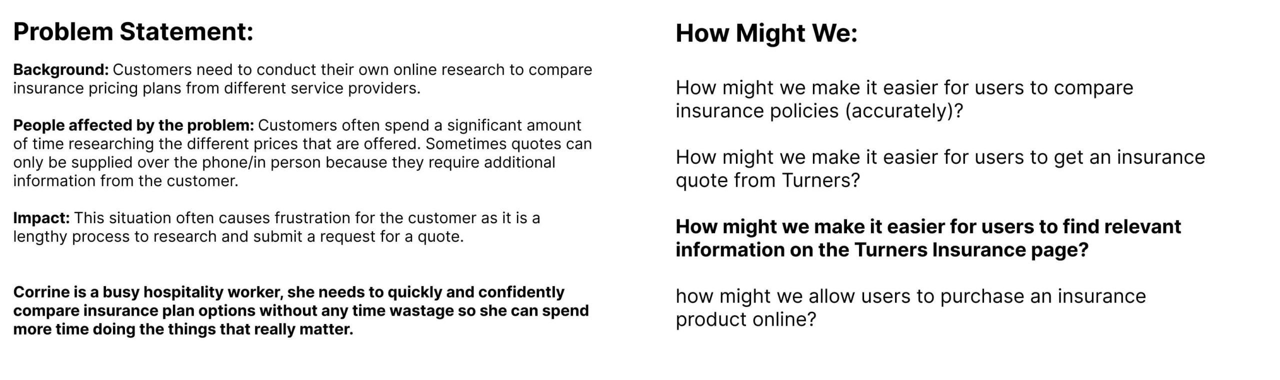
Problem statement & how might we statements
Cementing our foundation with a well-defined persona, an empathy map, and a user story set the stage for the subsequent design phases.
However, merely having these tools was not enough; we needed to convert this foundational knowledge into actionable insights. Hence, we crafted a problem statement which succinctly encapsulated the core challenges our users faced.
This statement served as a compass, ensuring that our design decisions consistently addressed genuine user needs. To further facilitate ideation and brainstorming, we employed ‘How Might We’ statements. These open-ended prompts stimulated creative thinking, encouraging our team to explore diverse solutions and avenues.
By leveraging both the problem statement and ‘How Might We’ questions, we were able to ensure that our design solutions were both innovative and directly aligned with our user’s core requirements.
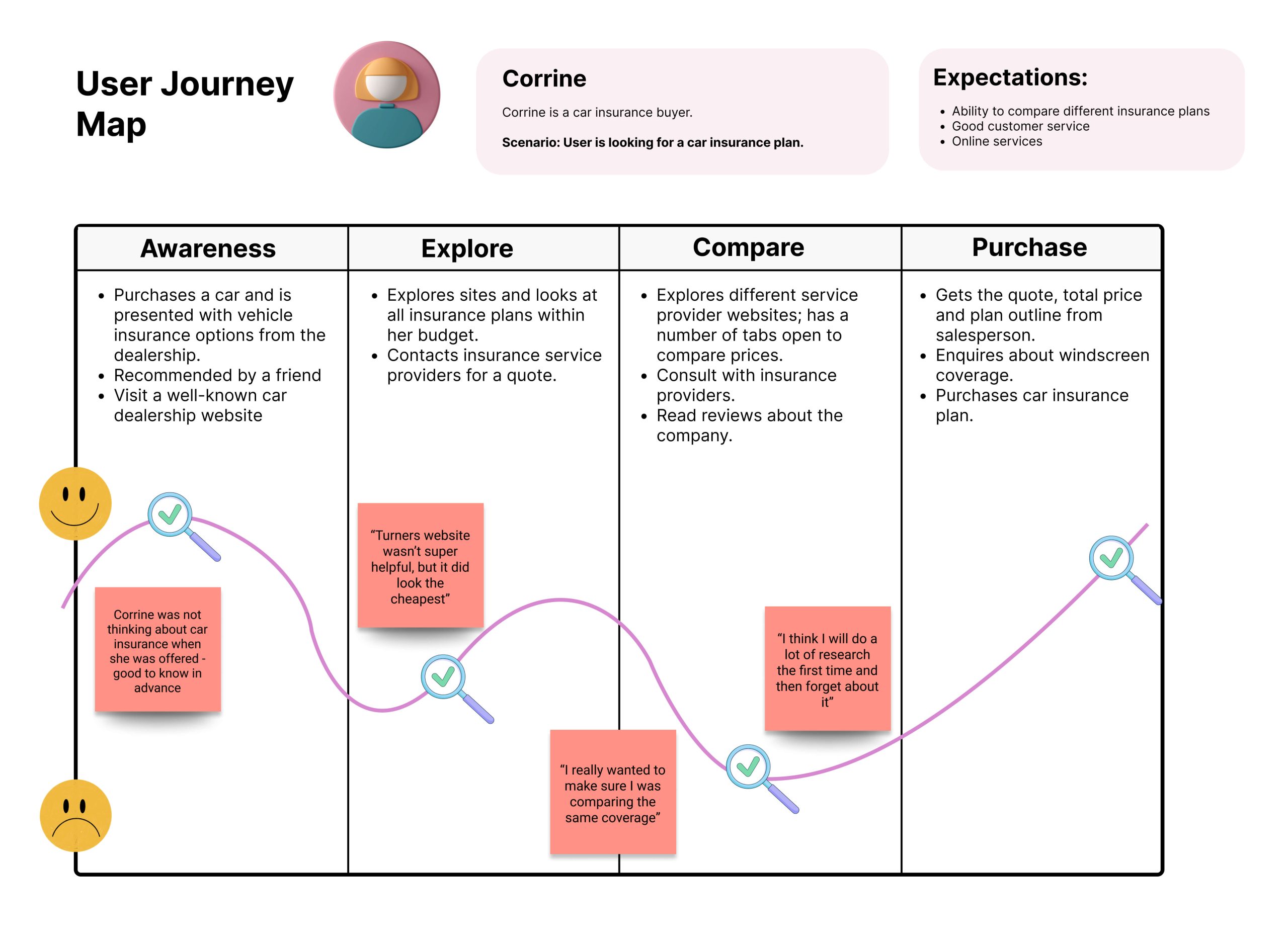
User journey map
And finally to effectively depict the current process that users undergo when arranging insurance through Turners Cars, we created a user journey map to visualise their experiences and pain points with the current insurance buying process.
Crazy 8s & Ideation
After compiling our research findings, we convened with our developers to seek their insights and initiate the ideation process, including Crazy 8s, to brainstorm potential enhancements for the existing insurance sales pipeline.
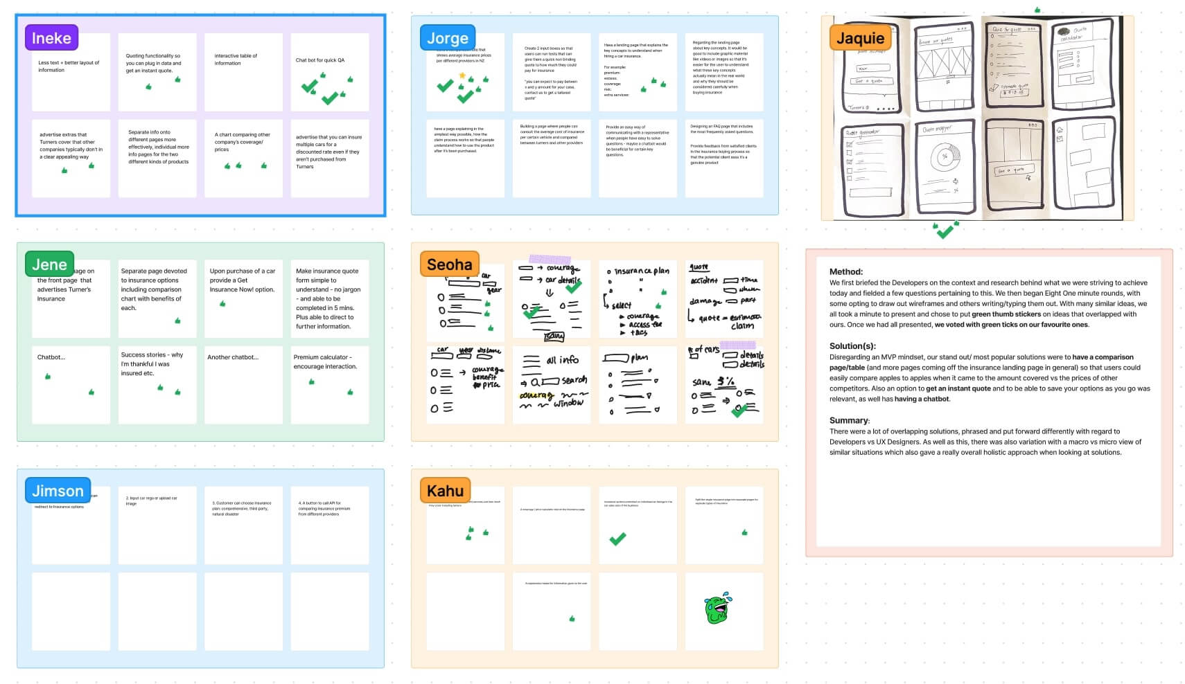
After generating ideas, we engaged in discussions to refine the optimal project direction and its scope. These brainstorming sessions allowed us to explore various possibilities and evaluate their feasibility. We assessed the potential impact of each idea, considering factors such as resource allocation, timeline, and alignment with our project objectives. Through collaborative efforts, we were able to shape a clear and strategic path forward, ensuring that our project would not only meet its goals but also exceed expectations.
Developer Feedback
The implementation appears straightforward, with the most challenging aspect being the creation of the Quote Estimator, which, even in its complexity, remains relatively simple.
The Estimator’s functionality involves dynamic form transitions as users progress through the process, facilitated by JavaScript. It seamlessly retrieves data from the API.
Upon receiving results, users have the option to save the quote as a PDF document locally on their machine. Simultaneously, the quote details are transmitted to the Turners back end, categorized under “Saved Quotes” for future customer follow-up.
Should users choose to proceed with their purchase, they can seamlessly navigate through the form’s buying process. Upon completion, a confirmation screen and email notification are generated.
Information Architecture & User flow
Subsequently, we opted for a streamlined quote estimator and an update to the existing Turners Cars insurance landing page to maintain project scope and deliver a minimum viable product.
From this point onward, to fulfil the Mission Ready requirements, each designer pursued individual work on the designated solutions and I commenced the establishment of information architecture and user flow for my forthcoming redesign and quote estimator.
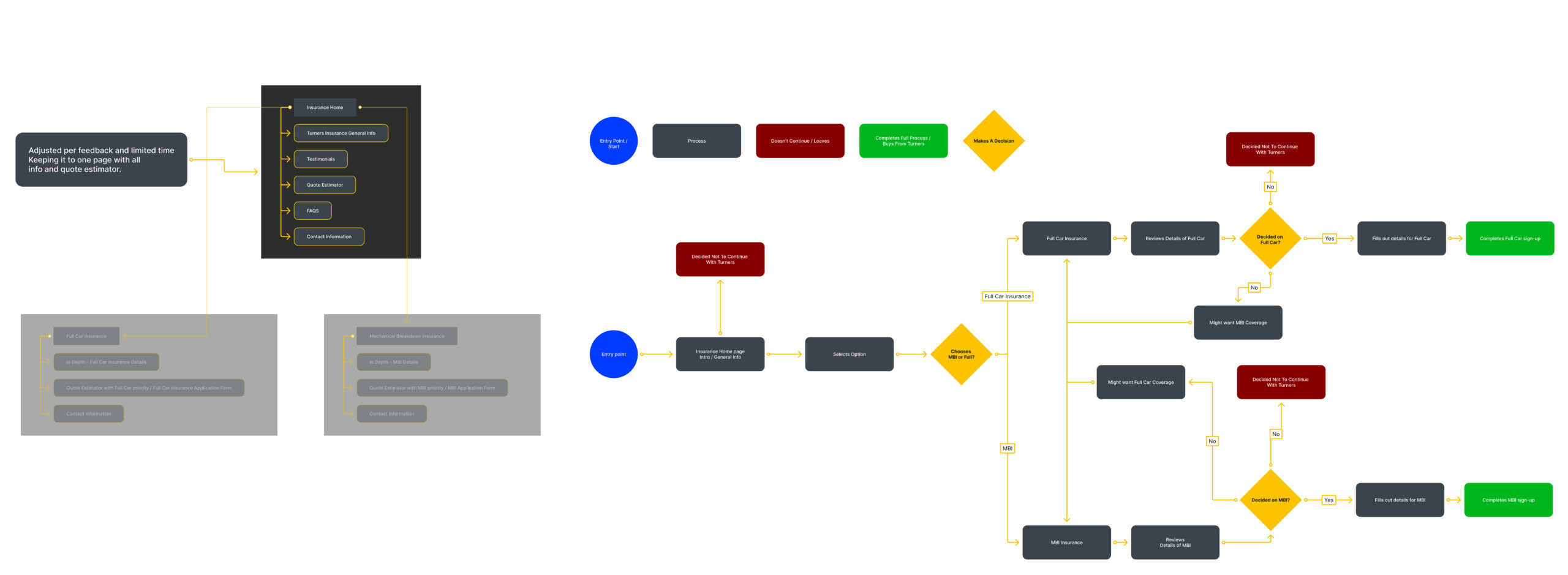
Initially, I envisioned dividing the existing insurance page into three distinct sections: a primary insurance landing page and two subsidiary pages dedicated to the specific insurance types offered by Turners. However, after careful iteration and review, I opted for a more consolidated approach. Instead of multiple pages, I chose to present all information regarding Turners Insurance on a single page, ensuring the information was formatted and conveyed in a more streamlined manner.
Wireframing
Building on the direction of the information architecture and user flow, the next step was to brainstorm new layouts and means of putting the chosen solutions into practice. Developing a user-friendly quote estimator and an enhanced Turners Cars’ insurance page.
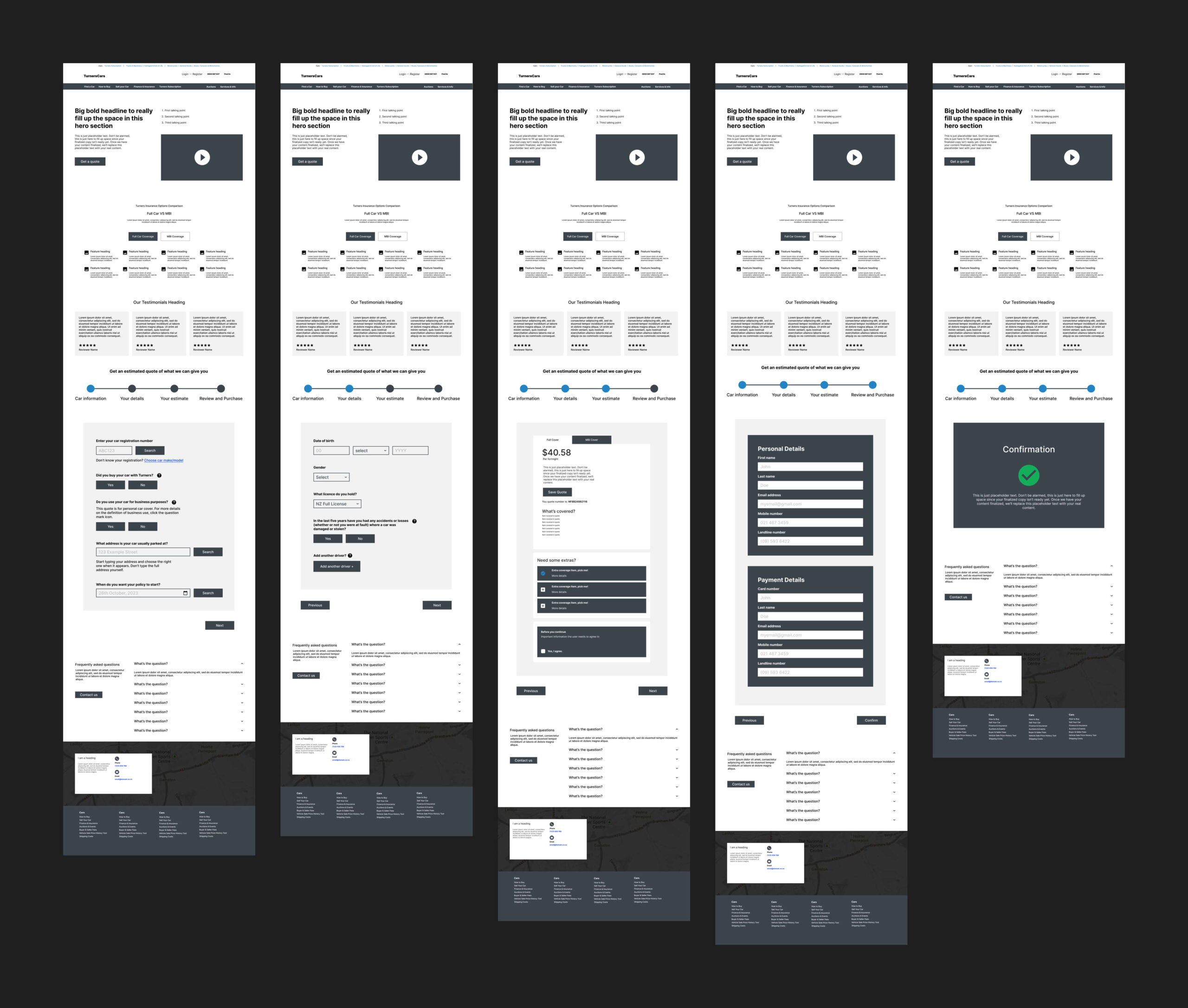
Prototyping & User Testing
After iterating through various wireframes and potential ideas, the final direction was turned into a prototype for user testing to ensure it was the best solution for the users needs.
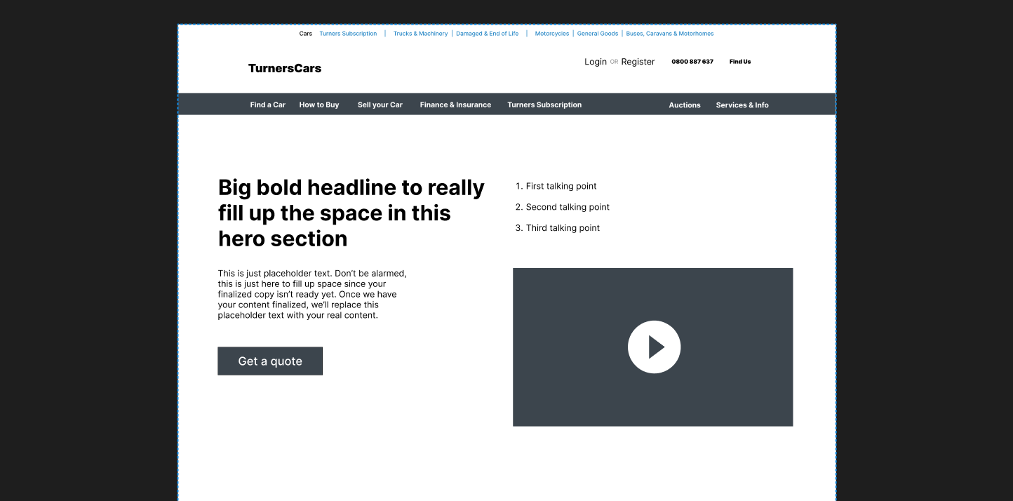
Overall, user feedback during testing was quite positive. The only issue found was with the ‘Get a quote’ button in the hero section of the webpage. Upon first viewing the webpage, this button would immediately grab the user’s full attention and distract them. Consequently, users would ignore the presented information and head straight to the quote estimator, where they would become confused, thinking they were signing up to buy insurance without a clear understanding of Turners’ offerings and without being ready to purchase.
To address this, the button was changed to play the promotional/informational video in the hero section and of course the call to action was changed from ‘Get a quote’ to ‘Watch our quick breakdown’. This adjustment helps direct users to gather more information easily before they proceed to use the estimator.
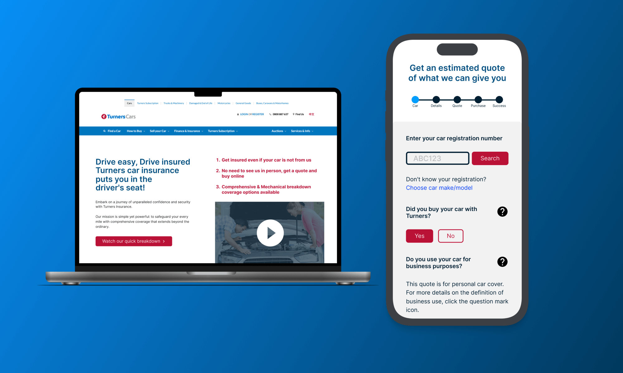
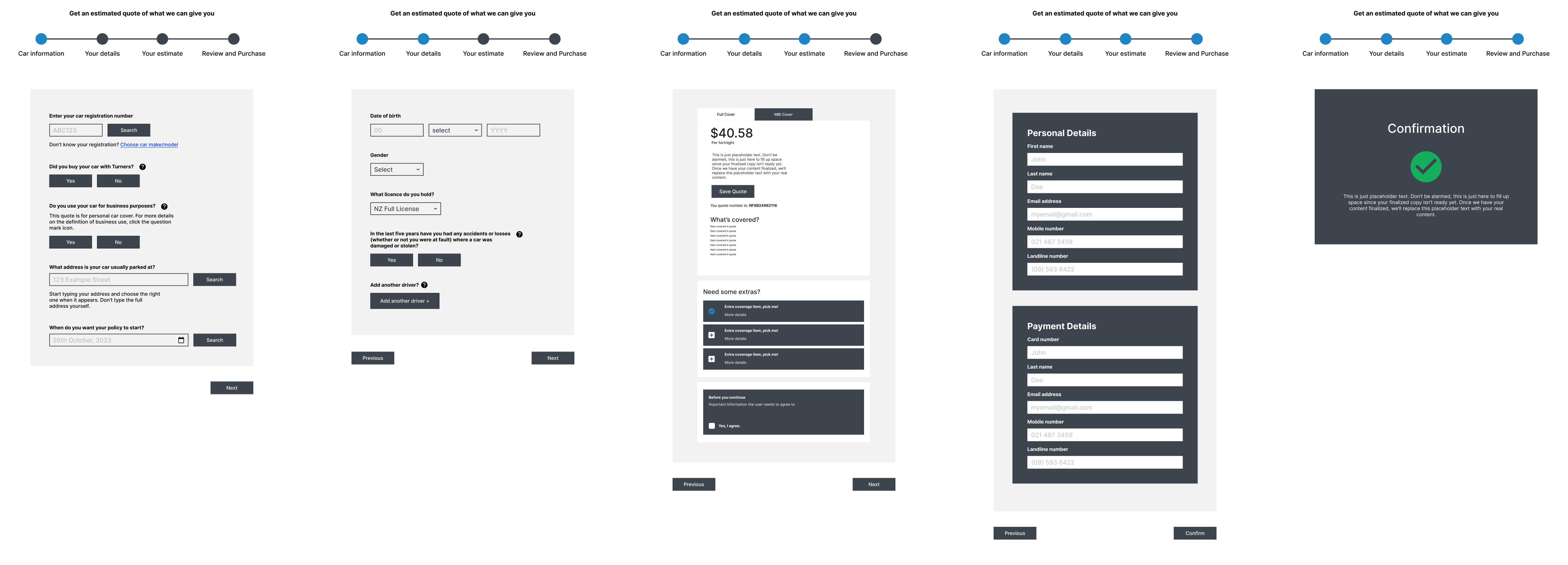
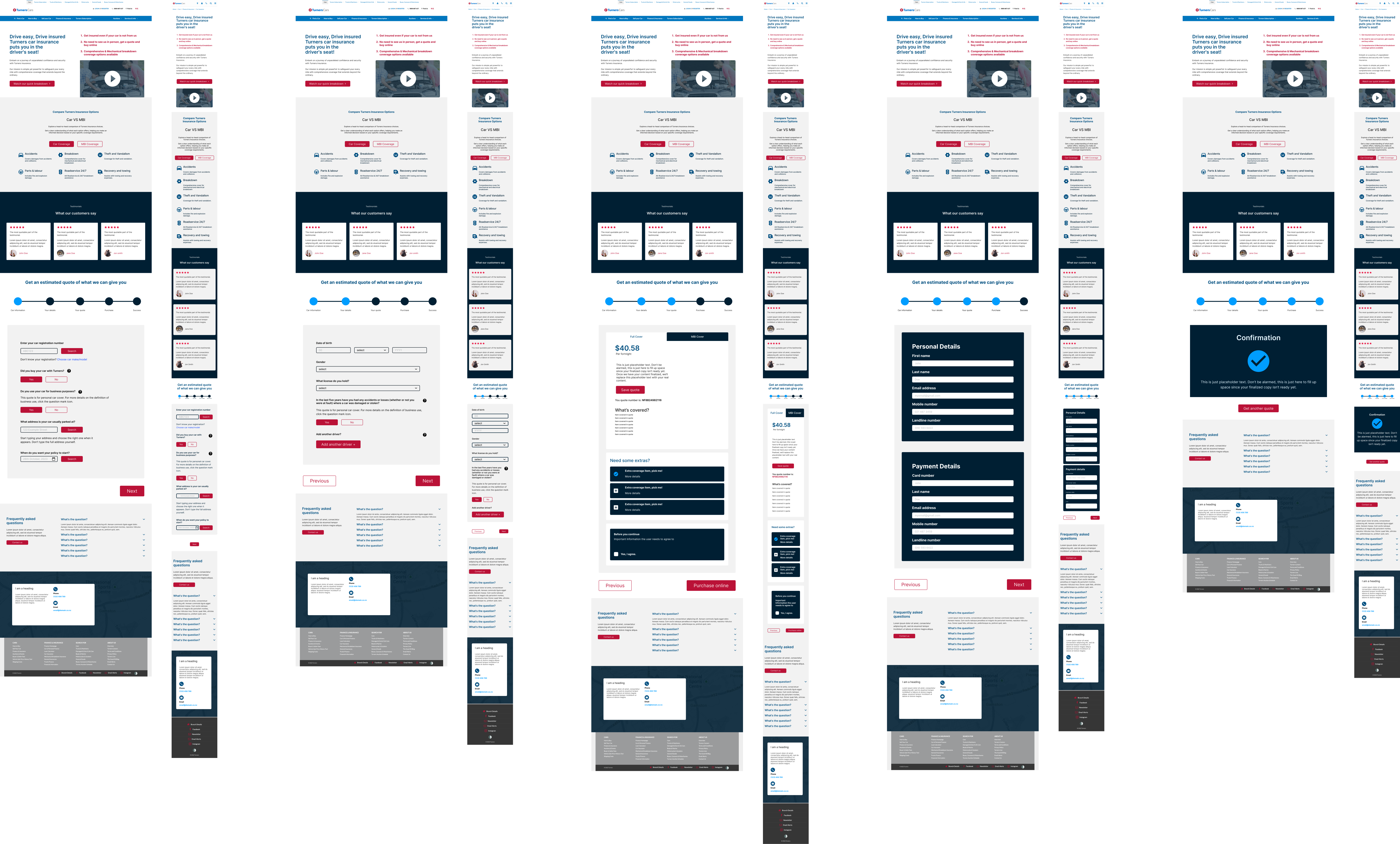
Quote estimator
After addressing the insights gleaned from user feedback, the focus then shifted to refining the user journey pertaining specifically to the quote estimation process. This process was meticulously designed to balance both the need for gathering adequate information and ensuring a seamless user experience.
- Car Registration & Usage: Users start by inputting their car’s registration, indicating whether they purchased their car from Turners or somewhere else , and specifying the car’s primary use (personal or business). They also provide the car’s regular parking address and choose a policy start date.
- Personal Background: Users offer personal information, including date of birth, gender, and driving license type. They’re queried about past driving incidents and can add another driver if needed.
- Quote & Coverage Options: An estimated quote is displayed, allowing users to toggle between different coverage types. A detailed breakdown clarifies the coverage, and users have options to enhance their package with add-ons.
- Final Details & Confirmation: Users input personal and payment information, acknowledge necessary terms, and receive a confirmation upon completion.
This design streamlines the estimation process, offering clarity at every step while ensuring user-friendliness.
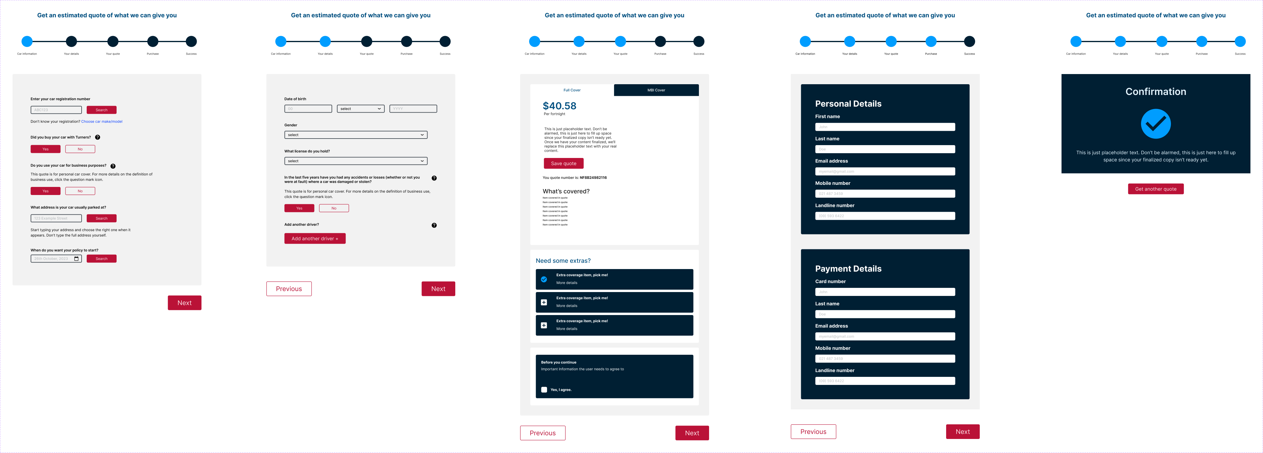
Final Mockup
After extensive testing and valuable feedback, it was time to finalise the design mockups. A central challenge during this phase was the integration of the brand’s strong and competitive colours—red and blue. These vibrant hues, while integral to the brand’s identity, could potentially dominate and disrupt the design’s aesthetics.
The key to harmonising them was to strike a balance: using them judiciously as accents and exploring various shades to ensure visual appeal. By carefully calibrating their presence, the final design not only maintained brand consistency but also achieved a visually engaging and user-friendly experience.
Embedded Figma File
Zoom in or out to inspect the embedded Figma file.
Conclusion
Upon concluding the Turners Cars project, the final mockups offer a clear visualization of the journey we’ve undertaken to reach this point. The iterative process of research, ideation, wireframing, and prototyping culminated in a design that encapsulates both user needs and business objectives.
The final mockups present a seamless and intuitive user experience, emphasizing user-friendly navigation and clear call-to-actions. Aesthetically, the design aligns with Turners Cars’ brand identity, ensuring that users feel a sense of familiarity and trust while interacting with the platform. The layout optimally utilizes space, making information presentation coherent and easily digestible.
One of the standout features of the final design is its adaptability across devices. Whether viewed on a desktop or a mobile device, the interface retains its clarity and functionality, ensuring users have a consistent experience.
In retrospect, the final mockups are not just a product of technical and design proficiency but also the countless hours spent understanding the user and the nuances of their interactions with the Turners Cars platform. This design stands as a testament to the collaborative efforts of the project team and the valuable feedback from stakeholders and users alike.
By leveraging user insights and integrating them with design best practices, we believe that this final mockup will drive user engagement, increase conversions, and enhance overall user satisfaction for Turners Cars.